Pops
It’s flippin’ food.
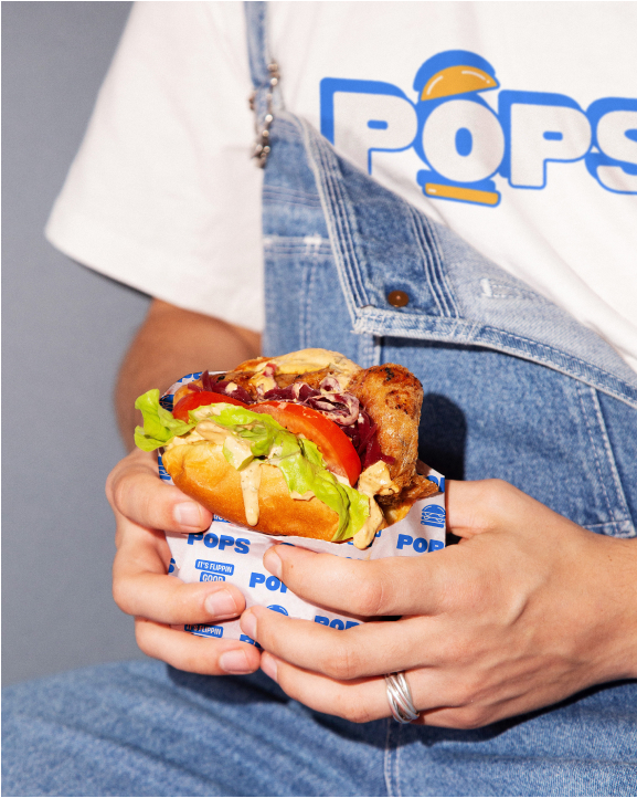
Pops is a burger shop designed with kids in mind. Its family-friendly atmosphere and simple menu invoke the nostalgia of mid-century fast food chains, serving as a gathering place for people of all ages.
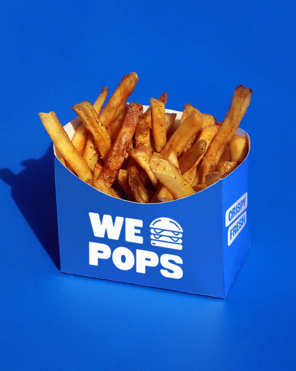
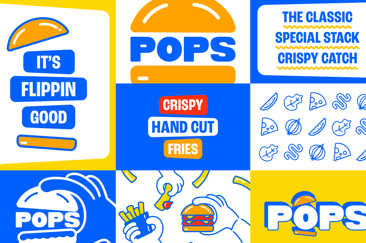
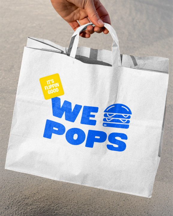
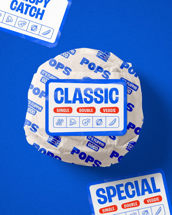
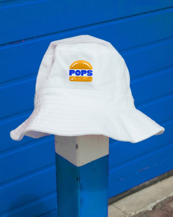
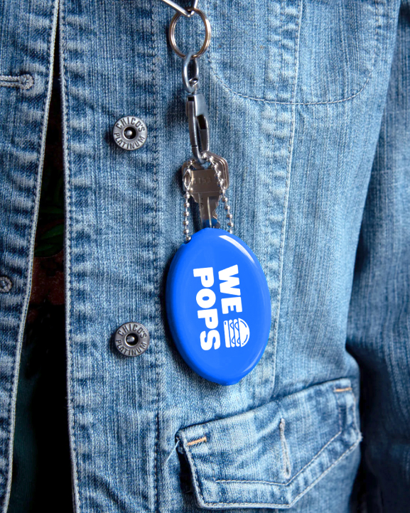
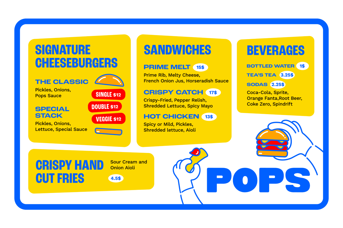
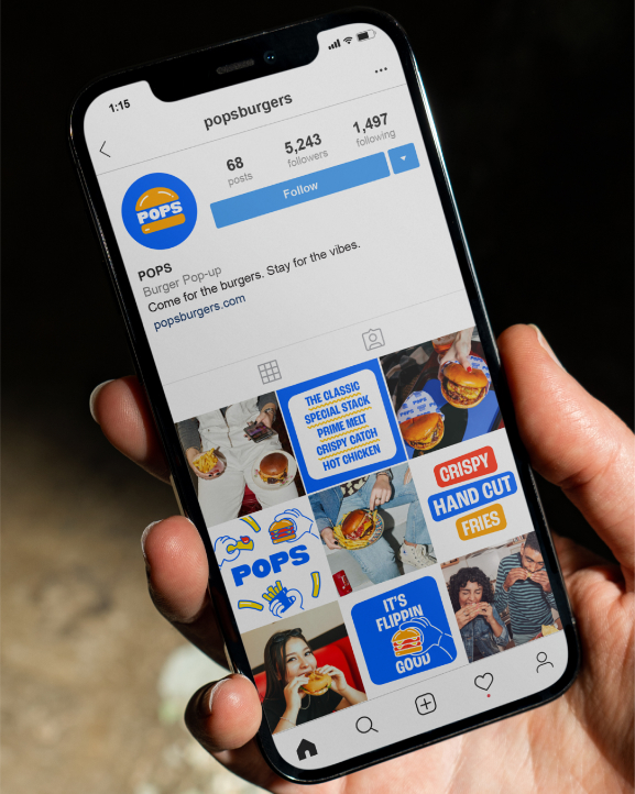
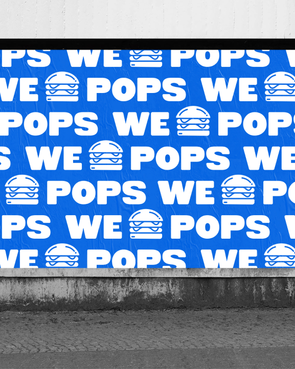
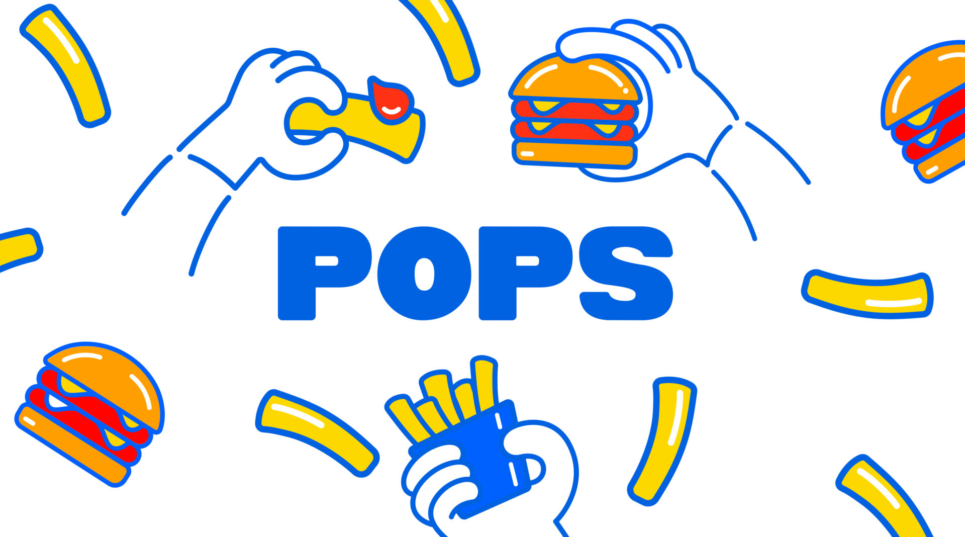
We developed its branding from scratch to visually engage children and help make dining more fun for the whole family. Inspired by Saturday morning cartoons, we designed an energetic logo in an ownable blue, diverging from commonplace red fast food chains. Cheerful illustrations and menu callouts add even more personality. The primary colored palette fully flavors the youthful spirit of the branding.
Our playful brand identity for Pops ultimately captures the fun of comfort meals in community.
What we did
- Brand Personality & Voice
- Verbal Identity and Messaging
- Brand Identity
- Print Design
- Packaging
- Signage & Environmental Design
- Visual Identity System
- Merchandise
