William Greenberg Desserts
Decades of Decadence.
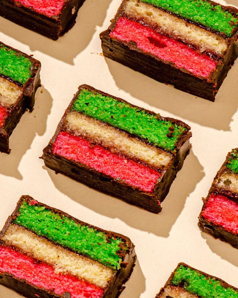
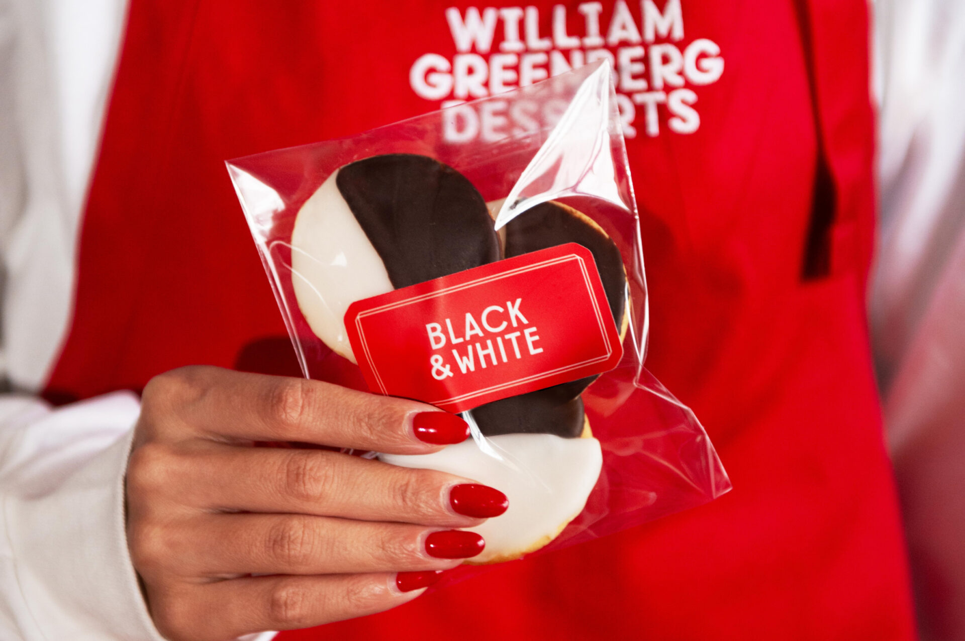
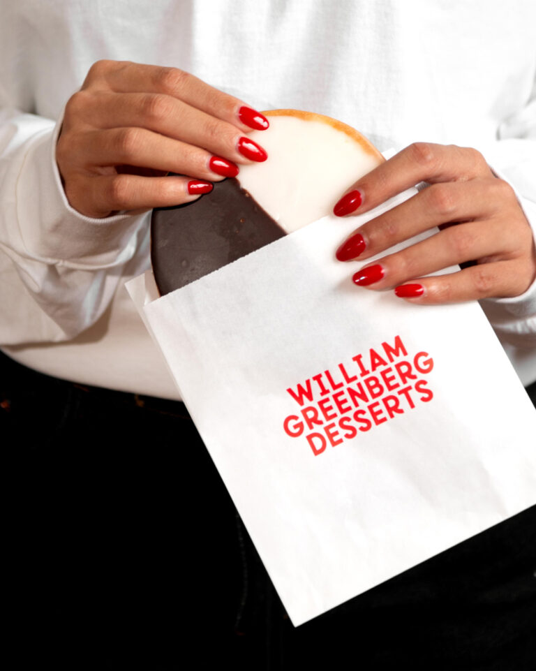
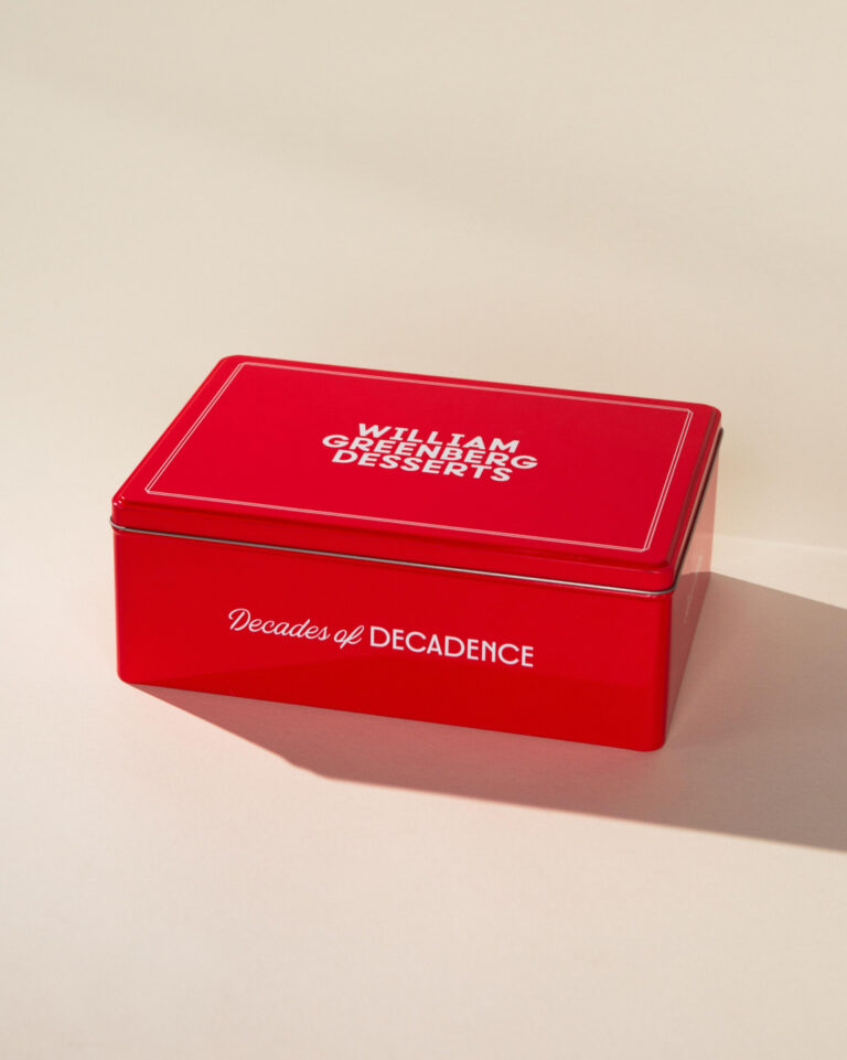
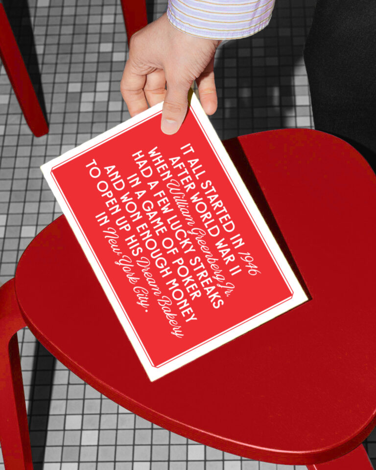
It all started in 1946 after World War II when William Greenberg Jr. had a few lucky streaks in a game of poker and won enough money to open up his dream bakery in New York City. The bakery has been a classic ever since, known for both its black and white cookies and its iconic red cookie tin–both featured in shows like Seinfeld and Mad Men.
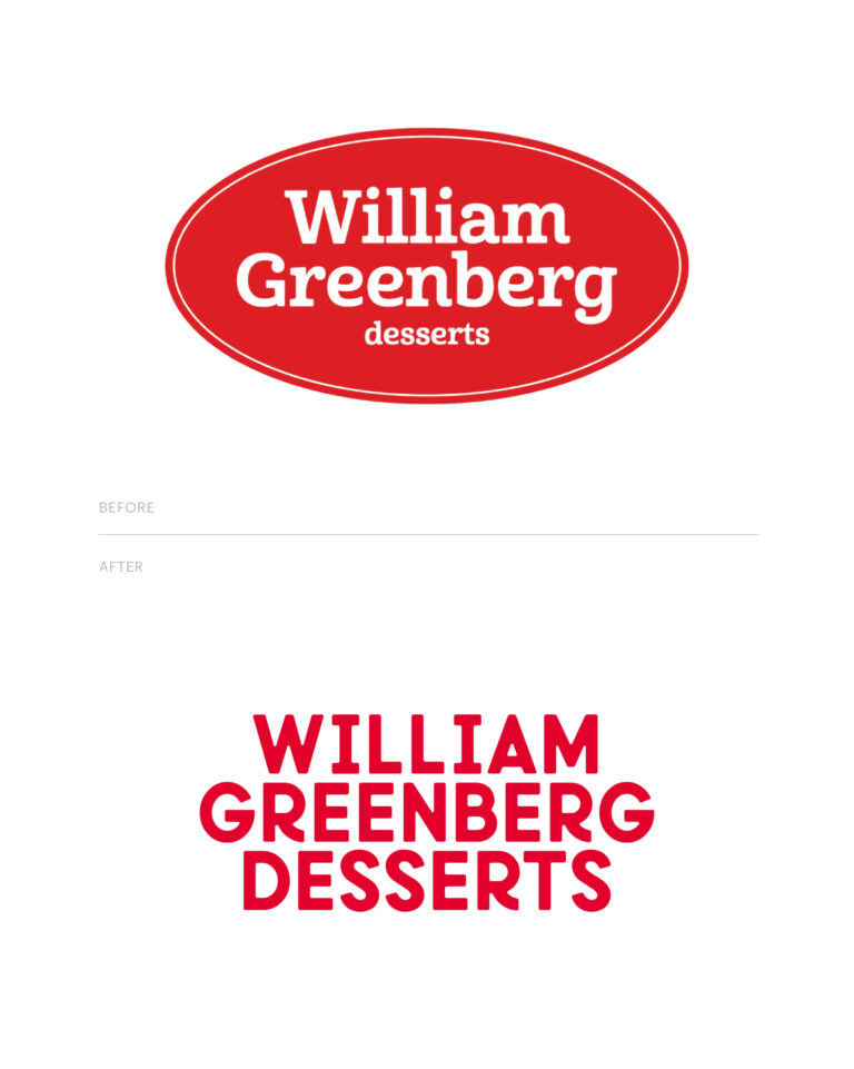
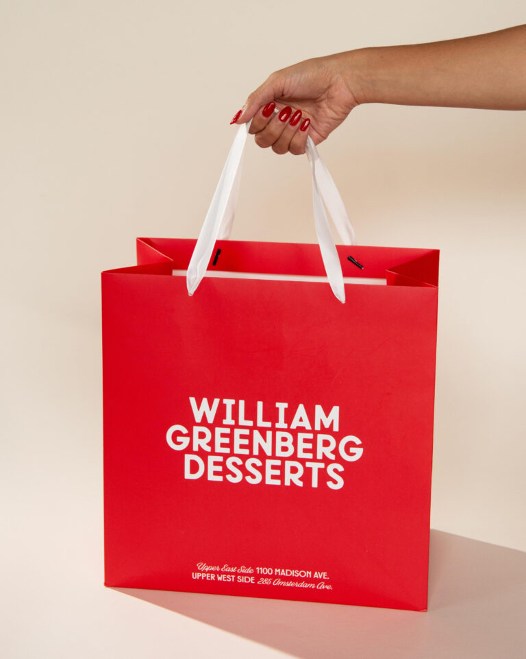
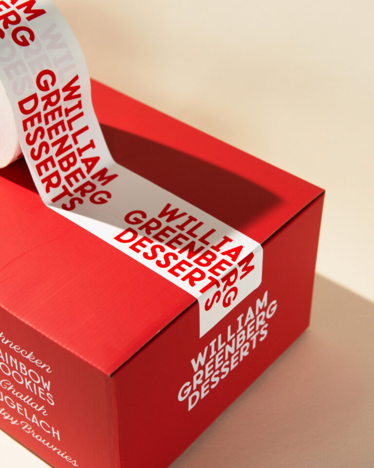
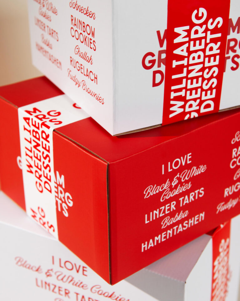
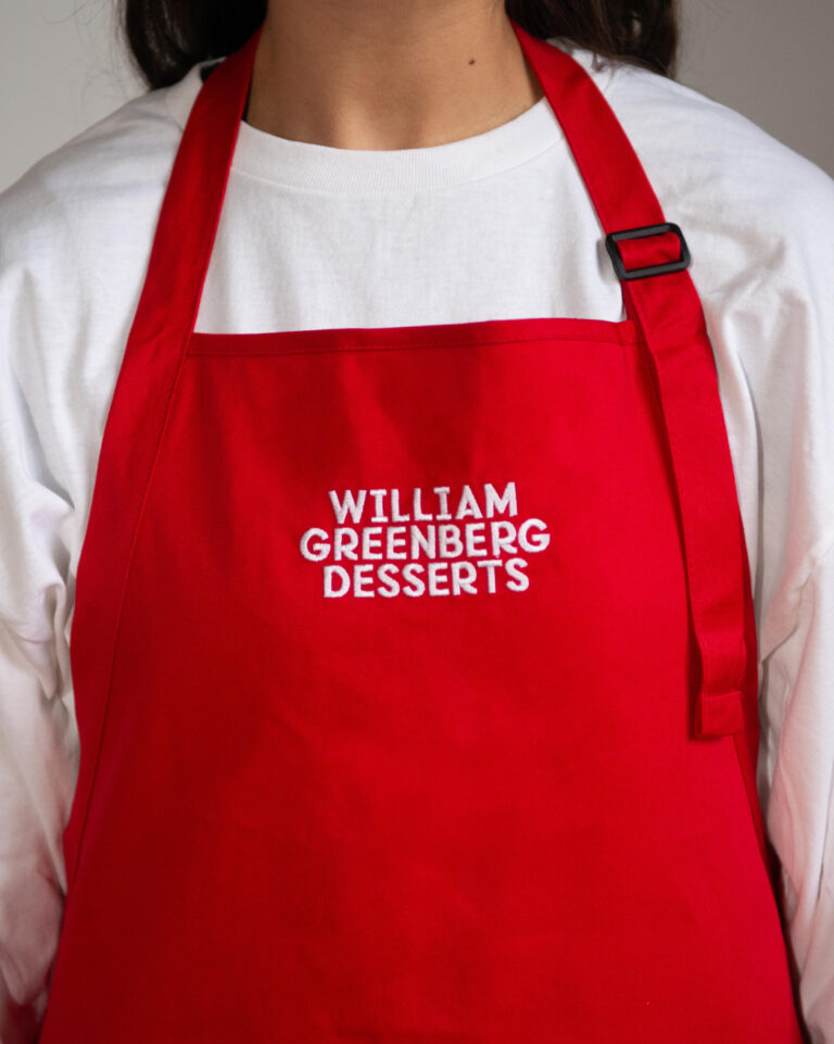
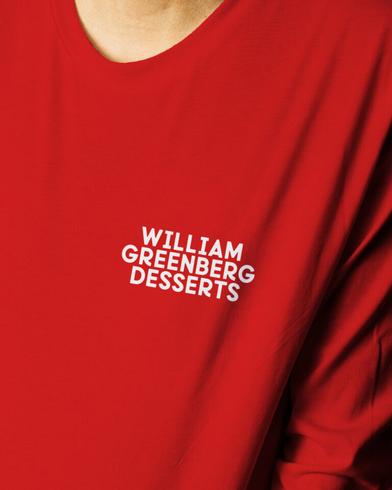
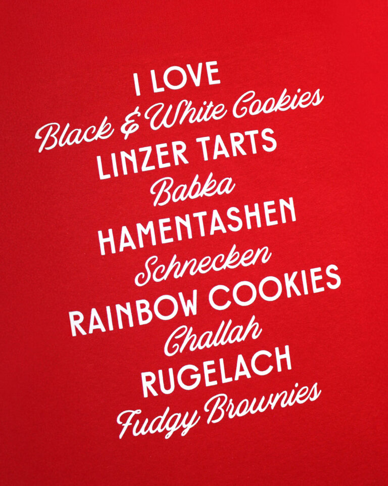
We were honored to refresh the branding of the bakery and help it appeal to a new generation of dessert lovers. Maintaining the signature red, we revived the logo to appear fuller and friendlier, pairing perfectly with hand drawn illustrations of sweet treats. Crisp borders and whimsical type flourishes breathe more life into the bakery’s heritage, evoking trust and modernity.
Blending classic charm with contemporary design, Greenberg boasts a new look that resonates with long-time patrons and first time customers.
What we did
- Naming
- Brand Strategy & Positioning
- Market & Competitor Analysis
- Brand Personality & Voice
- Verbal Identity and Messaging
- Brand Identity
- Print Design
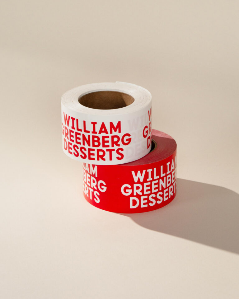
- Packaging
- Digital & Web Experience
- Art Direction, Photography & Video
- Signage & Environmental Design
- Visual Identity System
- Print & Digital Campaigns
- Merchandise
- Marketing
