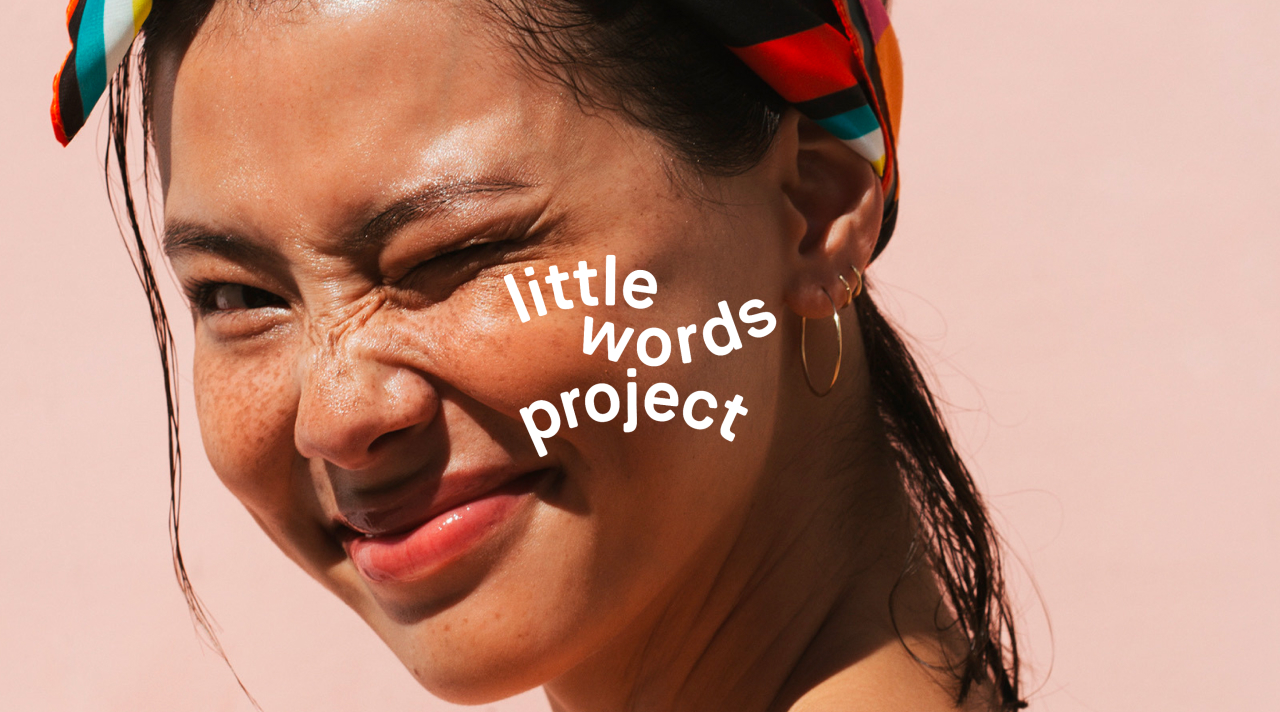
Little Words Project
It’s cool to be kind.
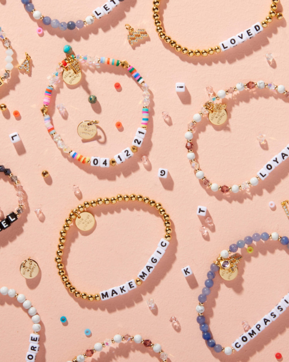
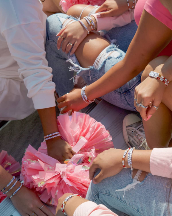
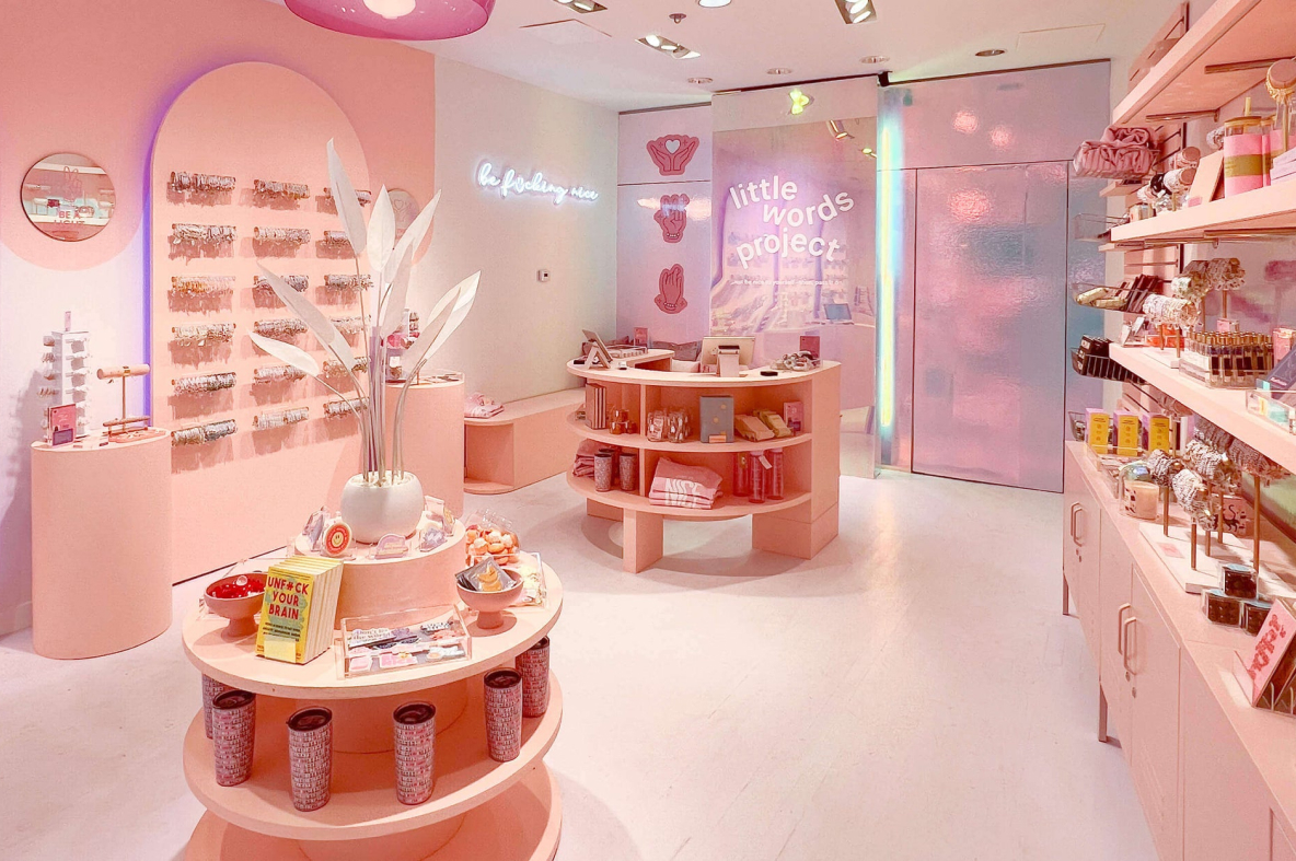
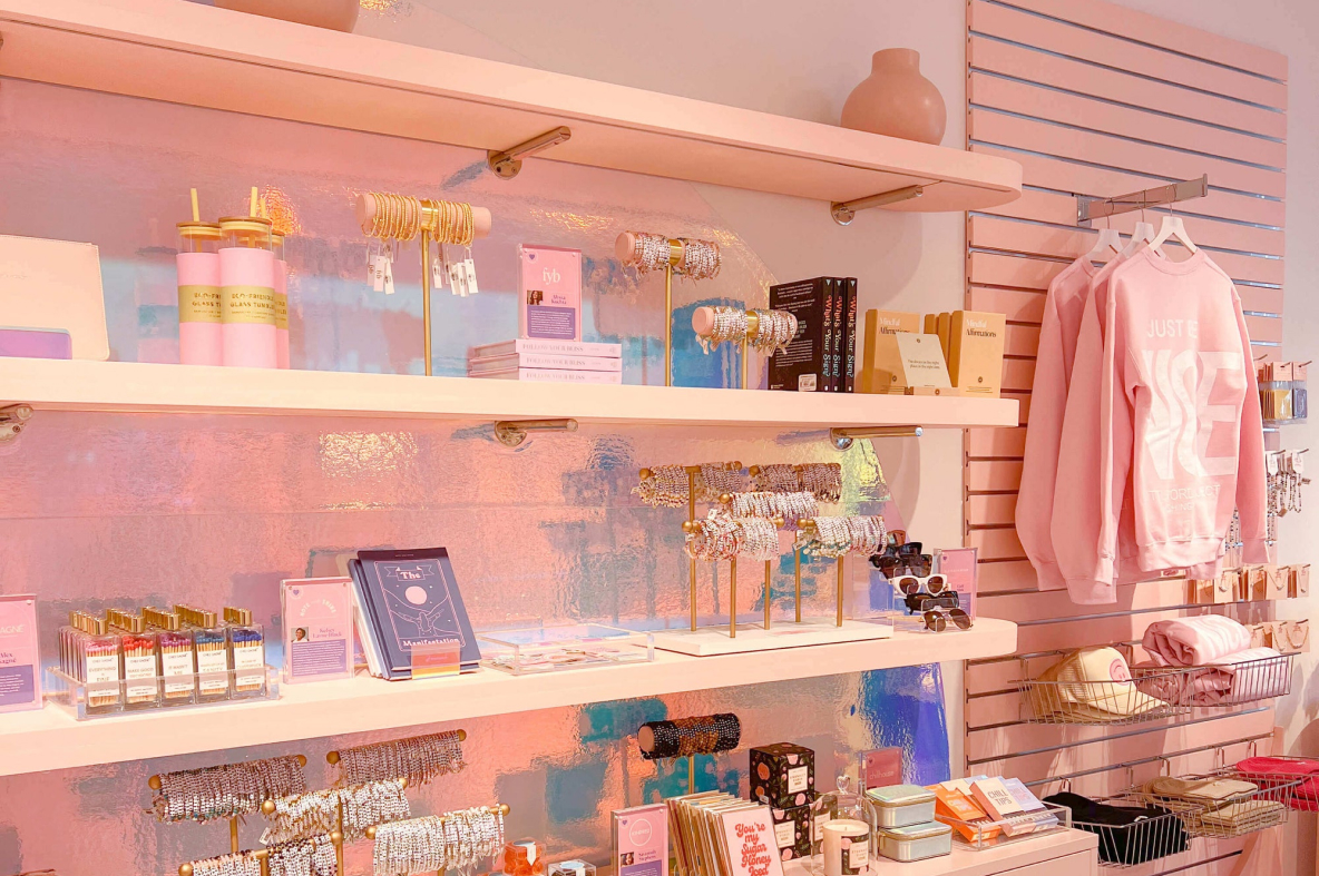
The Little Words Project was born out of a personal mission to spread kindness and affirmation through fun, customizable beaded bracelets. Every bracelet is unique, making them a powerful tool for personal expression and community support.
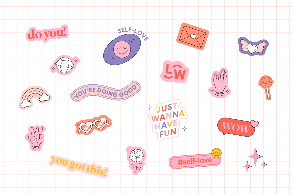
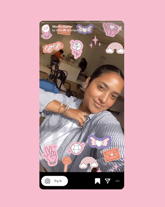
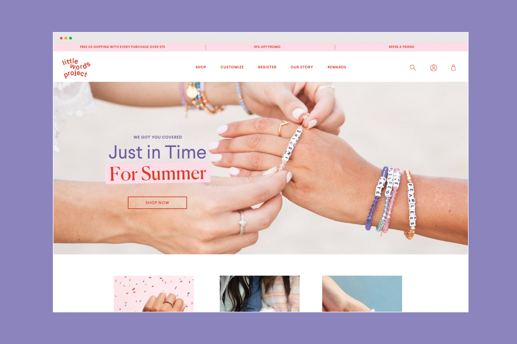
Our branding helps visualize the brand's mission, drawing in hopeful women everywhere. The logo reflects the bracelet's physical form with its gentle curves, emulating movement and flexibility. The feminine, pink and purple color palette comprises a sweet sentiment, which is further accentuated by delicate typography and clean, inviting illustrations. These design elements work in harmony to create a cohesive brand identity that is both heartwarming and visually captivating.
The Little Words Project beautifully encapsulates the spirit of compassion, transforming simple bracelets into powerful symbols of positivity for all generations.
What we did
- Brand Strategy & Positioning
- Market & Competitor Analysis
- Brand Personality & Voice
- Verbal Identity and Messaging
- Brand Identity
- Print Design
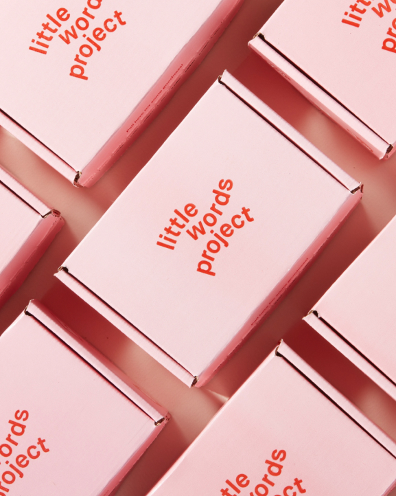
- Packaging
- Digital & Web Experience
- Art Direction, Photography & Video
- Signage & Environmental Design
- Visual Identity System
- Print & Digital Campaigns
- Merchandise
- Marketing